Charting and Data Visualization Tricks in Excel
October 26, 2022
Make your Excel Charts Shine
On-Demand Webinar
Charting and Data Visualization Tricks in Excel, was our last MrExcel webinar of the 2022 calendar year. Watch the webinar recording and learn how to efficiently use the charting and data visualization tools.
This webinar will show you:
- Two ways to plot Excel data on a map
- Setting chart defaults to simplify chart creation
- Using icon sets, data bars and color scales to add meaning
- Adding a trendline to forecast future data (with or without seasonality)
- Show cash flow with a waterfall chart
- Add cutout people to your reports
Meet the Presenter

Bill is the host of MrExcel.com and the author of 64 books about Microsoft Excel including Excel Gurus Gone Wild, Pivot Table Data Crunching, and Excel Inside Out.
He has made over 80 guest appearances on TV’s Call for Help with Leo Laporte and was voted guest of the year on the Computer America radio show.
Furthermore, Jelen has produced over 2,400 episodes of his Excel video podcast ‘Learn Excel from MrExcel’. Before founding MrExcel.com in 1998, Jelen spent twelve years “in the trenches”, as a financial analyst for the accounting, finance, marketing, and operations departments of a publicly held company.
Previous Webinars Hosted by MrExcel
Additional Resources
Brochure
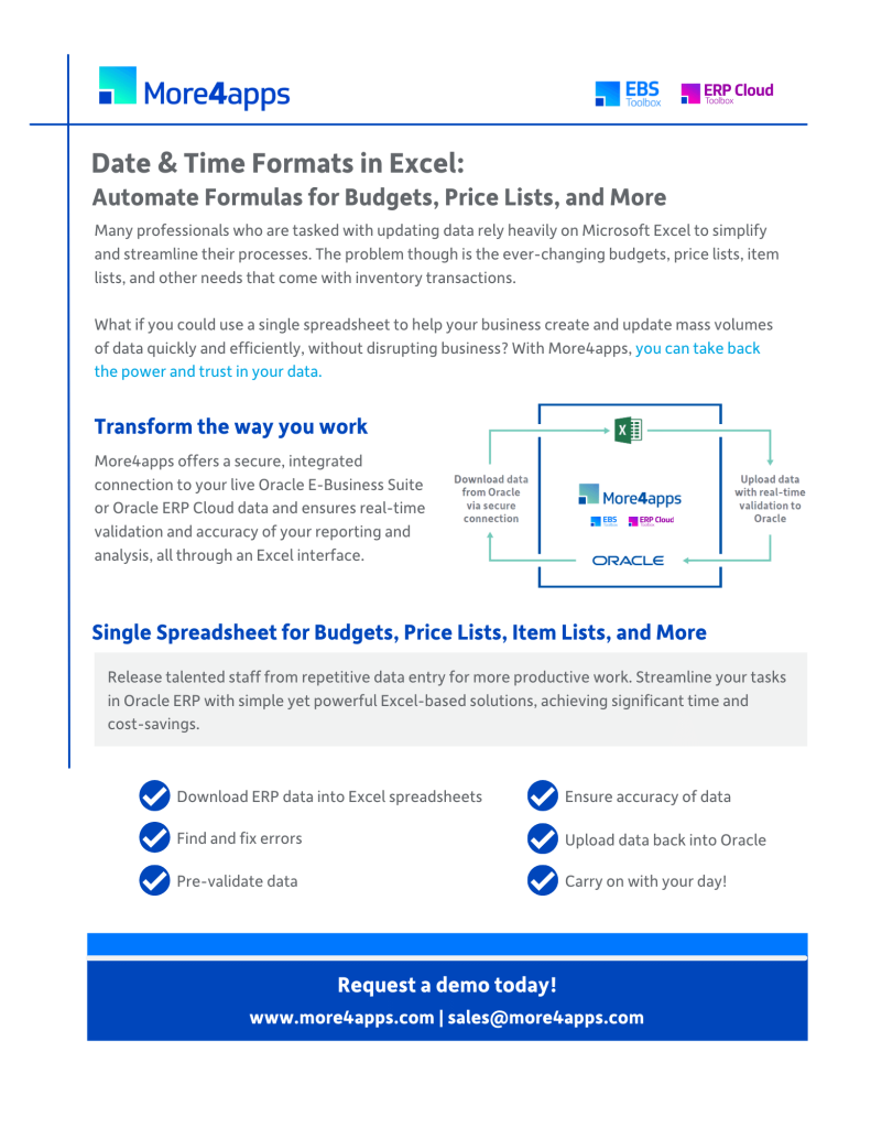
Date & Time Formats in Excel: Automate Formulas for Budgets, Price Lists, and More
Keep an eye on our events page for upcoming MrExcel webinars, browse our Resource Library for additional materials or connect with an expert today!


